

Hitler meets Klimt: How I designed a book cover

This post was going to include preliminary cover design ideas for Outside Heaven’s Sway, but length compelled me to split the post into two parts. What follows then, is the story behind the cover design for By Violence Unavenged.
About a year before publication, while By Violence Unavenged was still a battered draft, my husband Francis and I began work on cover designs. Our cover morphed through several Amazon templates before we swapped to InDesign, which we used to produce the final cover.
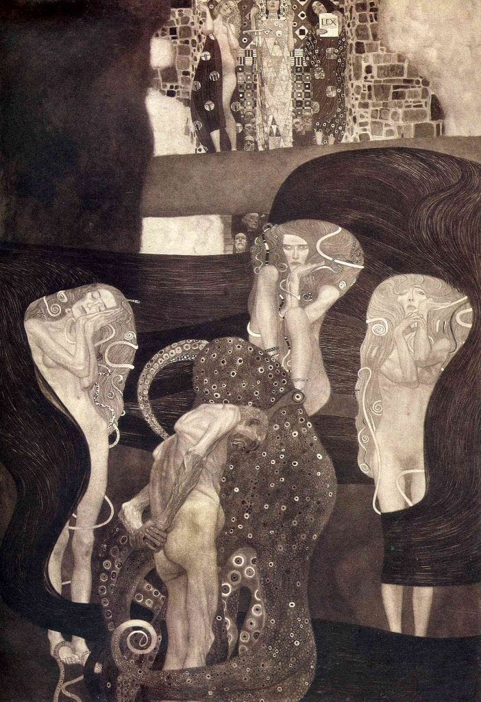
When I write stories, an artwork that encapsulates the story eventually comes to mind. In the case of By Violence Unavenged, which is mostly set in Vienna, it was Gustav Klimt’s Jurisprudence.
Klimt painted Jurisprudence, along with Medicine and Philosophy, between 1900 and 1907, as part of the ceiling decoration for the Great Hall of the University of Vienna. Later known as the ‘Faculty Paintings’, the three paintings were rejected by the University for their ‘obscenity’ and their ambiguous use of allegory. A court case subsequently released the paintings from Ministry of Education ownership and returned them to the artist. Disgruntled and resentful, Klimt then had to repay his commission. This he did, aided by patrons and friends, among whom was the prominent Viennese industrialist August Lederer, who purchased Philosophy, and later Jurisprudence.
Jurisprudence depicts a condemned man, old and naked, entangled by an octopus which represents fate. Presiding at some distance from him, at the top of the painting, are female embodiments of Jurisprudence: Truth, Justice, and Law. Between the criminal and the figures of jurisprudence are three Furies, who represent vengeance, and whose presence suggests that justice is equivocal. For the criminal, they will wreak vengeance upon him should he swear a false oath. Yet they also suggest that the law is not always administered for upright purposes.
By Violence Unavenged explores the nature of justice and its relationship with truth, law, authority, the individual, and social responsibility. Like the Klimt painting, it acknowledges the predicament between crime and prosecution, for the protagonist Phoebe Raye must navigate how to deal with resolving a crime for which evidence and witnesses are inadequate, and the perpetrator has eluded the law.
It was fitting, then, that this first volume should include Jurisprudence in its cover. The question was, how?
At first, we experimented with the painting alone. Fortunately, Jurisprudence is in public domain, so we did not have to worry about copyright. Very early attempts to use metallic gold, as per Klimt, made the cover exude tackiness. Instead, we worked with a black and yellow colour scheme because, for the sake of historical context, I wanted to pay homage to the Habsburgs. In a cleaning frenzy, I threw out the early ‘editions’, and only have a partial photo by way of example.


An additional problem was that while the Klimt captured thematic ideas, and paid partial homage to the cultural context, it had little explicit connection with the 1930s Viennese setting of By Violence Unavenged, and, notably, the Anschluss.
So we hunted down a suitable Anschluss photograph and settled on this one, featuring crowds cheering Hitler and his entourage in Vienna’s Heldenplatz.
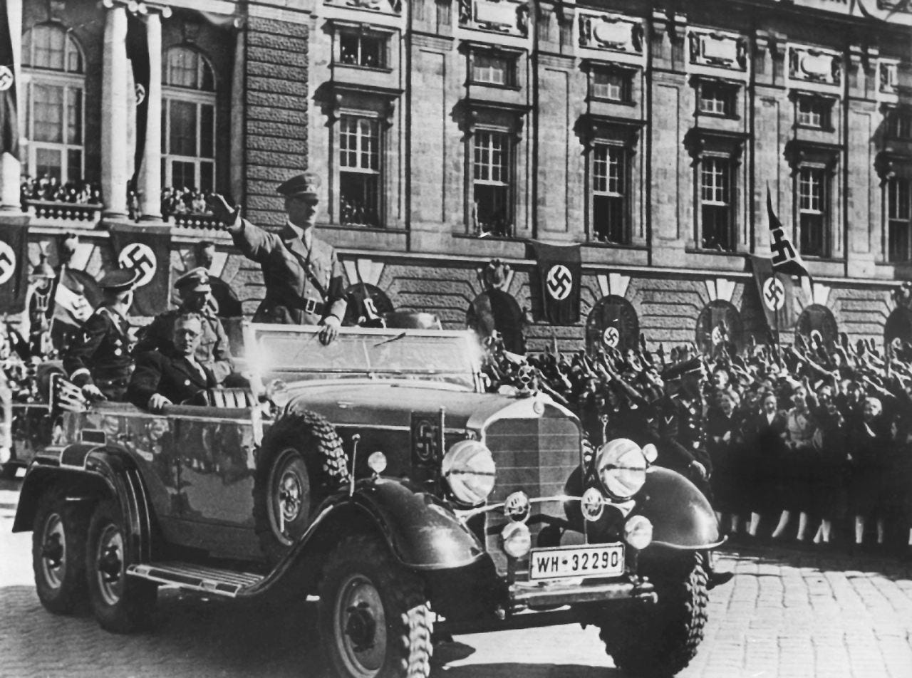
Aside from the improvised swastika on the Austrian flag in the background (left), what I particularly liked was the expression on the face of Arthur Seyss-Inquart, the plainclothes man seated in the Mercedes. Seyss-Inquart was the Austrian Machiavelli who succeeded in pulling off the Anschluss without any resistance. Of Sudeten-Czech origin and a competent lawyer, he had long been in favour of union with Germany, and looked forward to a Zusamenschluss, or ‘sweet union’ as he called it, a federation which would respect Austria’s political independence. Increasingly supportive of the Nazis, he wormed his way into the Austrian parliament, and, by 1938, was Minister of the Interior. Seyss-Inquart, however, would be outwitted by Hitler, who, during his Heldenplatz speech, impulsively proclaimed the total integration of Austria into the German Reich. It would be interesting to know whether this photograph was taken before the speech or after, in order to determine whether Seyss-Inquart is stunned by the crowd reception, or by Hitler’s news.
Initially, we included a small scale version of the photograph on the back cover. What I did not like, however, was that the Klimt and the photograph were kept separate. It was boring. Significantly, it did not capture the tension in the novel, let alone the pernicious destruction wrought by the Nazis in Austria. As for the yellow and black colour scheme, well, I dubbed it the urinal edition.


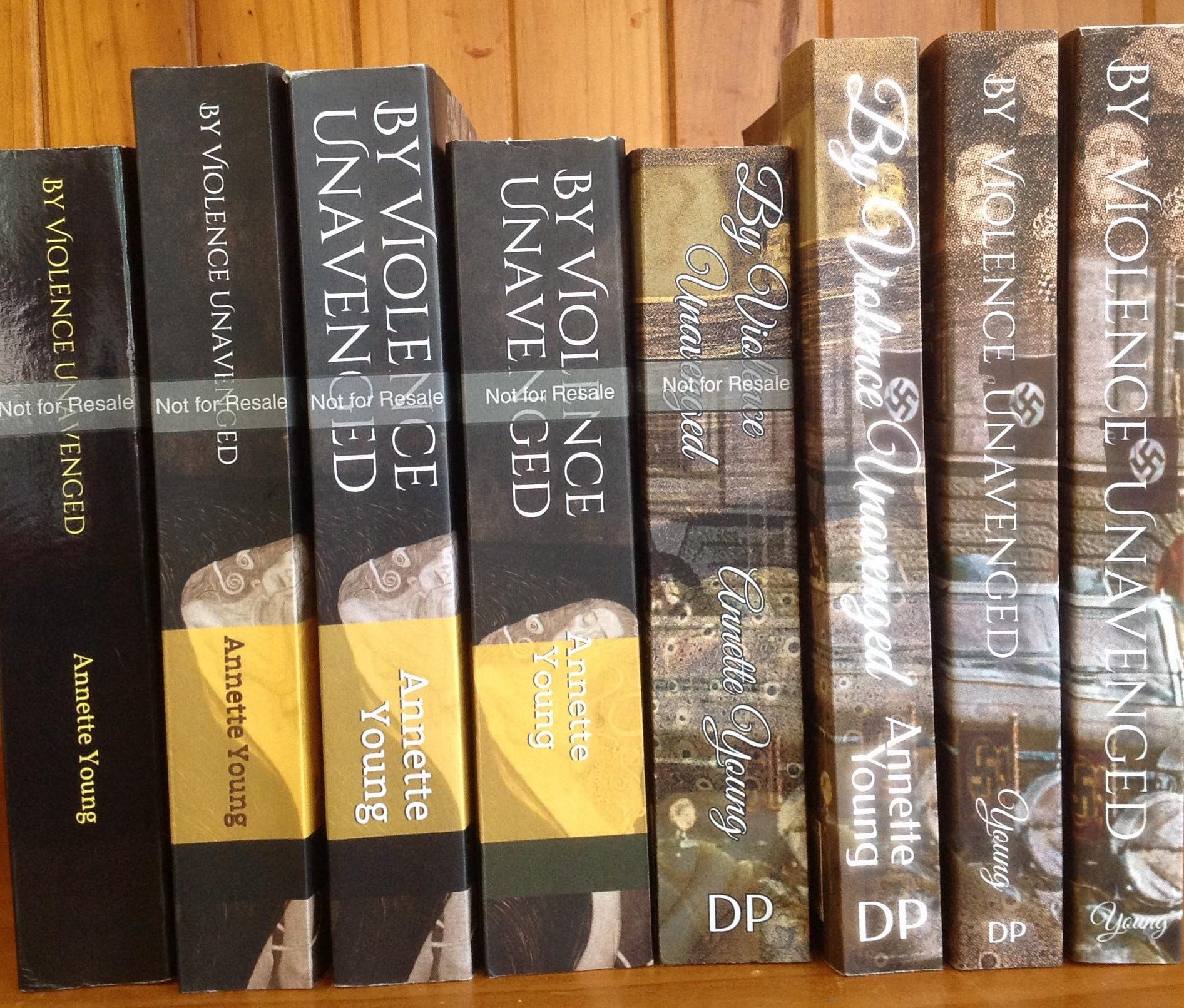
So, we integrated the two pictures (you can see this in two of the pictures above), and changed the colour scheme to elegant, creamy coffee tones, which also invoked Vienna, and which offset the eye-catching red which would be used on the swastikas. To ensure a swastika appeared on the spine, we did a cut and paste.
I was very happy with the outcome:
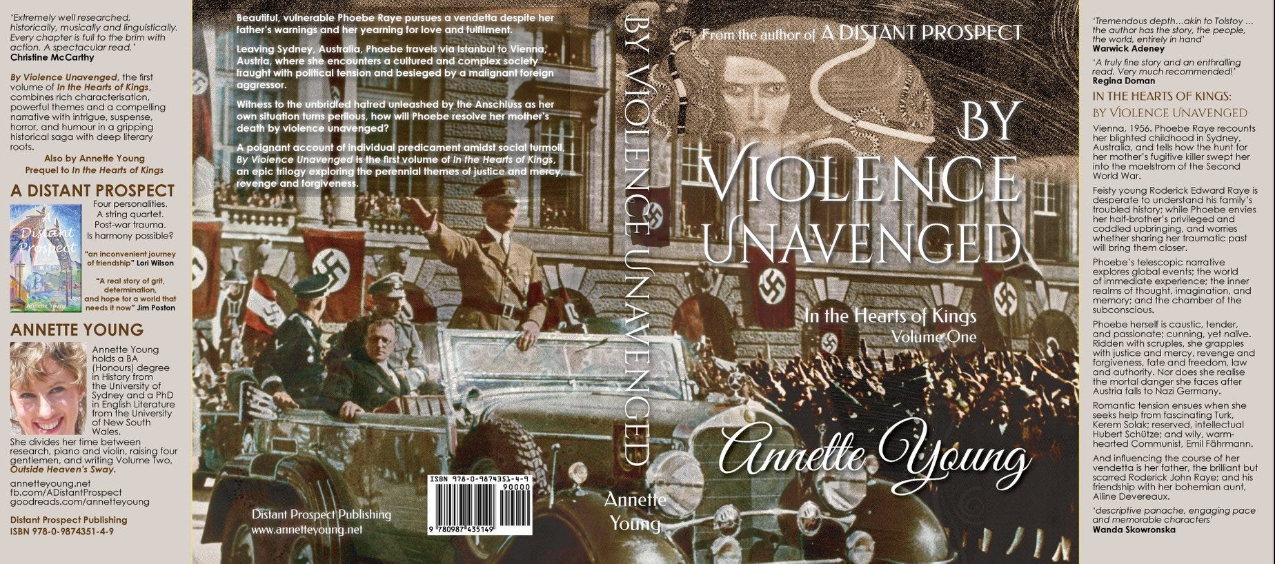
Since Klimt’s work was deemed ‘Degenerate Art’ by the Nazis, it was appropriate to have a Klimt painting overwhelmed by a photograph of Hitler entering Vienna to infer the cultural revolution that took place under the Nazis.
It becomes even more resonant when you know the fate of the painting.
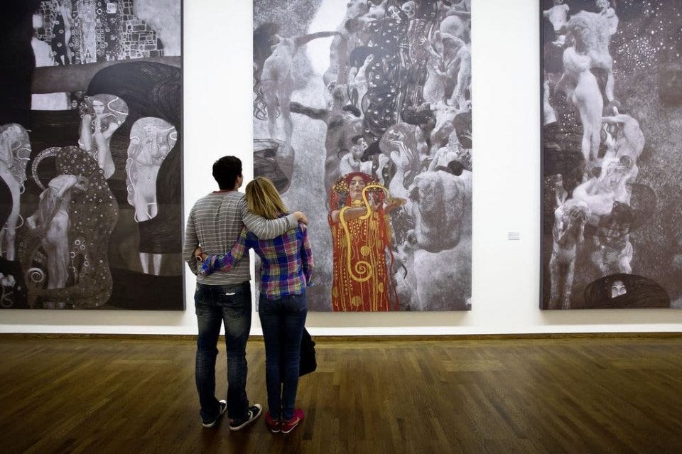
Following the Anschluss in 1938, the Jewish Lederer family fled Austria, and their art collection was seized by the Nazis. In 1944, Jurisprudence and Philosophy were hidden, along with other seized artwork, including Medicine, in a castle northwest of Vienna, Schloss Immendorf, which subesquently was razed during battle operations between retreating German panzers and allied forces, in May 1945. Only photographs and preliminary sketches remain. (You can read more about the Faculty Paintings, here. The Belvedere features AI generated colour interpretations of the Faculty Paintings, here.)
As for the moody, brooding fury who stares from out the painting, she aptly reflects the narrator and protagonist, Phoebe Raye, who questions whether or not to take the law into her own hands and avenge her mother’s murder. And the vengeful fury applies as much to Herr Hitler and his determination to avenge the Treaty of Versailles, as it does to our Phoebe. No rear views of women in red on this book cover, for this is not your conventional World War Two novel. Glaring, bold, and angry, our fury instead confronts potential readers, as if to say, ‘Read me, if you dare’.


Settling on a font that made an unusual word like ‘unavenged’ attractively spaced and easy to read, and that would also work for subsequent volumes, proved challenging. We decided on ‘Cinzel’ for the title for the above reasons, and also because its knife-edge clarity complemented the novel’s energy and tension. ‘Great Vibes’ was seleced for the author name, mainly because my ‘proper handwriting’ is a distinctive, fluid roundhand, and I wanted to use that as a trademark. It also imparted an old-fashioned, literary quality, which was appropriate to the style of writing as well as the period. For the ancillary cover information we used the art deco font we selected for chapter headings, while the back cover blurb was typeset in an economical ‘keep calm and carry on’ font typical of the era.
Next week, I’ll show you some of the images I’m working with for the cover of Outside Heaven’s Sway.